by Olivia Hague
Analysing Furlough and Unemployment Rates Can Help Inform Post Pandemic Recovery Policy
The UK governments Coronavirus Job Retention Scheme has seen unprecedented levels of financial support in an attempt to keep businesses running during the COVID-19 pandemic. At its peak, the government was paying 80% of wages for eligible employees, easing the financial pressure on businesses and protecting jobs. As the furlough scheme is phased out, with a complete end date announced for September 2021, it is essential to analyse trends occurring throughout the longevity of the scheme. This analysis will look at the differing uptake rates of the Coronavirus Job Retention Scheme as well as patterns in unemployment that have accompanied the different stages of the furlough scheme. This analysis is part of a series on COVID-19, investigating the different effects and experiences of different groups, to inform recovery policy post-pandemic.
The data in this blog has been collected from publicly available government statistics, published by HM Revenue and Customs and the Office of National Statistics. This data has been processed using Python with the Pandas package, and visualised using Plotly.
Furlough by Sector
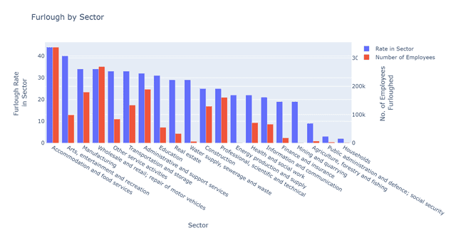
Figure 1 highlights the rate at which employees were furloughed by sector as part of the Coronavirus Job Retention Scheme at the end of June 2021. Whilst many sectors saw rates between 20% and 35%, the Arts, Entertainment and Recreations sectors and the Accommodation and Food Services sector saw the highest rates of furlough among their employees, with rates of 40% and 44%, respectively. These industries were severely impacted by COVID-19 restrictions that kept businesses closed as part of lockdown. In absolute numbers, the Accommodation and Food Services sector and the Wholesale and retail; repair of motor vehicles were the highest and both saw over quarter of a million people on furlough at the end of June 2021.
Furlough by Region
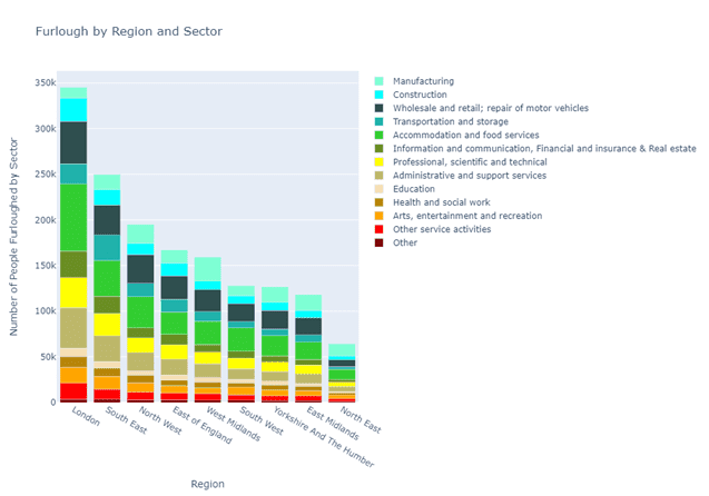
Figure 2 represents the regional variations of the Coronavirus Job Retention Scheme. London dominates the numbers of employees on Furlough, reflecting the size of the working population and impact of Covid restrictions in the capital. While Wholesale and retail; repair of motor vehicles and Accommodation and food services are high across each region, in London the Construction sector sees the third highest rates of furlough compared to other sectors in the region, representing the large scale of the sector in the region compared to other places. In the Southeast region, the Transportation and storage sector has the third highest furlough numbers, showing the high numbers of jobs in this sector compared to other regions, with the region hosting several major airports and ports.
Furlough vs Unemployment
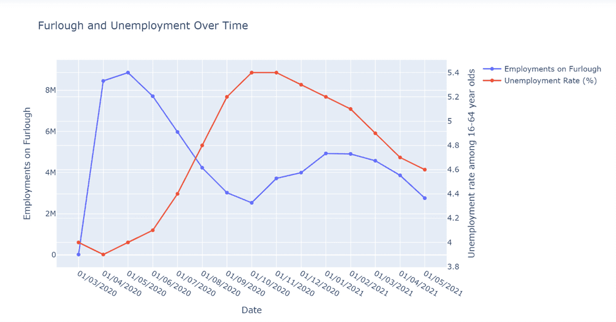
Figure 3 visualises the comparable trends of furlough numbers and the unemployment rate. From April 2020 unemployment began to rise rapidly as furlough was reduced, until October 2020 when furlough increased again, reducing unemployment. Unemployment has continued to drop after January 2021 despite furlough rates reducing again, suggesting the beginning of a post pandemic recovery in the job market although this is something policy makers will wish to monitor closely.
Unemployment Recovery
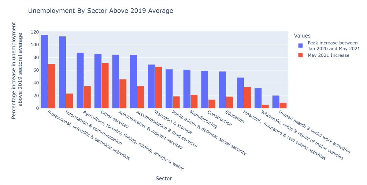
Figure 4 shows the percentage increase in unemployment by sector against the 2019 sectoral average baseline. In blue is the peak increase between January 2020 and May 2021, and in red is the most recent unemployment data for May 2021 expressed as a percentage increase on the 2019 sectoral average. Professional, scientific & technical activities and Information and communication sectors increased the most, with peaks that were more than double their pre-pandemic levels. Unemployment across all sectors is yet to return to the pre-pandemic sectoral average levels of 2019. There is however considerable variation between sectors, with the unemployment levels for Professional, scientific & technical activities; Other Services; Administrative & support services; and Transport & Storage Services sectors, remaining significantly above the pre-pandemic averages, while other sectors, including Information and communication; Wholesale, retail & repair of motor vehicles; Human health & social work activities; Education; Manufacturing; Public admin and defence, social security; and Construction sectors show significant signs of recovery.
This analysis has demonstrated the trends accompanying the Coronavirus Job Retention Scheme, showing variations between sectors and regions. It has shown the links between the furlough scheme and unemployment rates. Policy makers will wish to continue to closely monitor how unemployment in different sectors and regions responds to the winding down of furlough post pandemic.
Olivia Hague is studying a BA in Politics and Sociology at the University of Manchester and is a Q-Step Data Analyst Intern at Opsmorph.


