by Olivia Hague
The Effects and Experiences of COVID-19 Vary Among Demographics
The COVID-19 pandemic has brought light to many of the existing inequalities within society that bring different demographic groups varying levels of exposure and risk to infection. The vaccination programme is integral to reducing risk of infection and lowering the severity of symptoms experienced. This analysis is part of a series on COVID-19, investigating the different effects and experiences of different groups, to inform recovery policy post-pandemic. A focus on vaccinations can help to ensure all groups in society, especially already vulnerable populations are adequately protected.
Data Analysis Can Help Inform Post Pandemic Recovery Policy
The data in this blog has been collected using publicly available APIs including NOMIS and the UK Government Coronovirus API, processed using Python with the Pandas package, and visualised using Plotly and ipyleaflet.
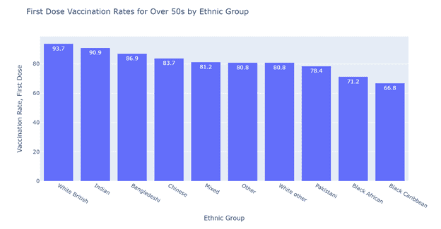
Figure 1 highlights the disparities in vaccination uptake amongst different ethnic groups in the UK. Amongst the White ethnic group, 93.7% have received their first vaccination dose, compared to the lowest uptake among the Black Caribbean ethnic group with a vaccination rate of 66.8%. There is variation in the uptake rates amongst ethnic minority groups in the UK, but all remain notably lower than the white population. Reasons for this ethnic variation in vaccine uptakes have been explored by the ethnicity sub-group of the Scientific Advisory Group for Emergencies (SAGE). Their report suggests barriers that ethnic minority communities may face in the vaccination process, including socio-demographic contexts, lack of communication, and differing perceptions of risk.
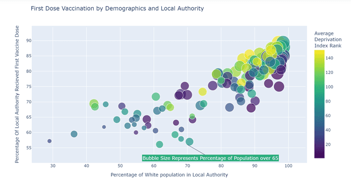
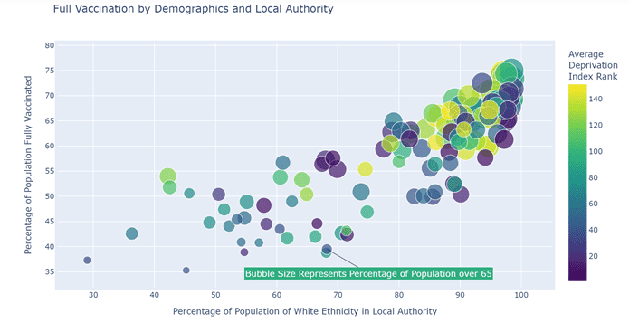
Figures 2 and 3 visualise the differing impacts of demographic factors on the vaccination rates of different local authorities. Data describing age and ethnicity at the local authority level is taken from the 2011 Census available via the NOMIS API, and the data describing deprivation is taken from the Deprivation Index from the English indices of deprivation 2019. Both the data for the first dose and second dose vaccinations demonstrate a correlation between vaccine uptake and age, deprivation and ethnic diversity in local authorities. As these factors are themselves often correlated, a bubble chart is a good visualisation tool for showing multiple simultaneous variations. Each bubble represents a local authority, the size of the bubble represents the percentage of the population over 65 with larger bubbles indicating a greater percentage, and the colour of the bubble representing deprivation with blue colours the most deprived (lower rank) and yellow colours the least (higher rank). At the lower end of vaccinations, are local authorities that typically have a lower population percentage from the white ethnic group, less over 65s and higher deprivation. The London borough of Newham epitomises this group of local authorities where the population is ethnically diverse, relatively young, amongst the most deprived, and amongst the least vaccinated.
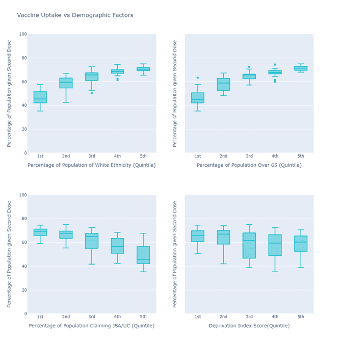
Figure 4 shows the differing impacts of age, ethnicity and deprivation on vaccination uptake as box plots using the data from Figures 2 and 3. Each box is a set of local authorities grouped by quintile of the x-axis, the 1st quintile is the lowest 20% of local authorities and the 5th quintile is the top 20%. The middle line in the box is the median value of the grouping, the top and bottom edges of the shaded box indicate the inter quartile range, while the very bottom and top bars indicate the miminimum and maximum values (outliers) for that group of local authorities. Univariate plots such as these compliment the bubble charts by making the relationship between vaccination and each demographic factor more evident. Top left visualises the correlation between local authorities with higher percentages of white people also having higher percentages of vaccine uptakes. Top right shows local authorities with a higher percentage of over 65s have higher vaccine uptake. Bottom left plots the percentage of the Local Authority claiming Job Seekers Allowance and Universal Credit, as reported by The Claimant Count 2020, accessed through NOMIS, showing areas with higher claimants having lower vaccination rates. Finally, bottom right presents data from the English Indices of Deprivation, showing that Local Authorities with higher deprivation have lower vaccination rates.
Geographical Variation in Vaccine Rates
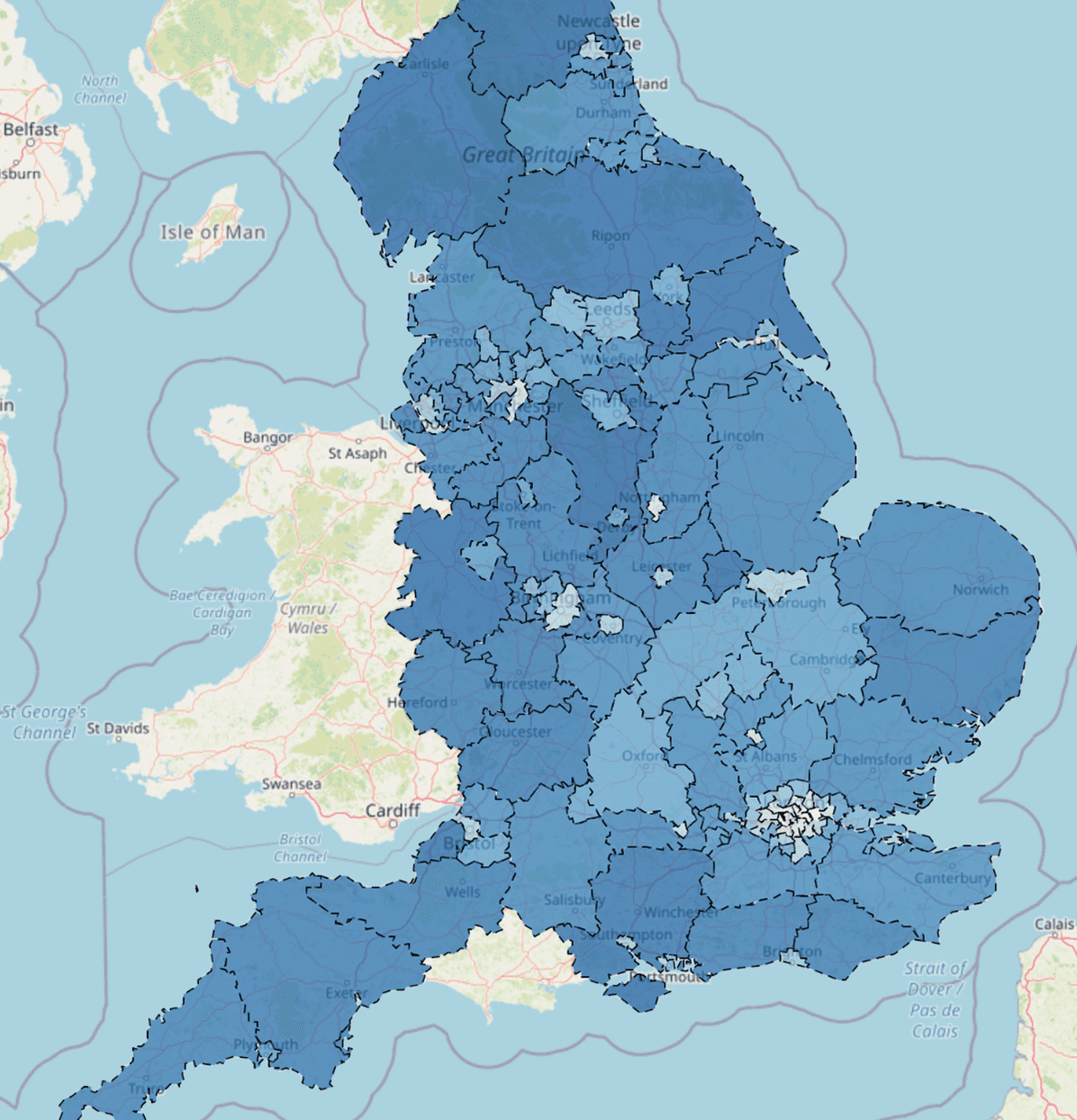
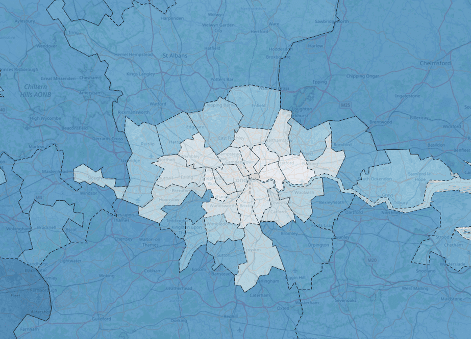
When vaccine data is visualised on a map, we can see a trend of lower vaccination rates in cities across England. This is most prominent in London, where we can clearly see the central areas displaying low vaccination rates (shown in lighter blue), surrounded by darker blue areas with higher vaccination rates. Other cities across the country follow a similar trend, with low vaccination rates seen in Manchester, Liverpool, Birmingham and Newcastle, visualised with lighter blue. These regional patterns are to be expected based on the previous plots and analyis as cities typically have a younger and more ethnically diverse population with higher levels of deprivation. That said, the geographical proximity of local authorities with low vaccination rates could exacerbate COVID-19 infections and illness.
This analysis has demonstrated a variety of interconnected demographic factors which may have an influence on vaccination uptake. Areas with more younger people, high ethnic diversity and deprivation have all been shown to correlate with lower vaccination rates.
Olivia Hague is studying a BA in Politics and Sociology at the University of Manchester and is a Q-Step Data Analyst Intern at Opsmorph.
